Find your perfect white paint—how to choose the right shade and finish
White paint is always a stylish choice, but it can be tough to pick the right shade and finish from so many options. Check out these tips from our interior journalists to succeed!
1. Choose the shade in the space
Finding the right white paint shade takes patience and a bit of preparation. Don’t pick color samples from a computer screen, because monitors don’t show colors accurately. Always choose your shade in the space where it will be used. Attach large color swatches to the wall one by one, and observe them in both natural and artificial light at different times of day.
Natural light varies by time of day and season. A cooler shade suits a sunny room, while a warmer shade works better in a shadier one. The exterior color of your home can also affect the light coming inside. Even the best white paint can’t adapt to every subtle shift in lighting, so choose the one that performs best overall.
2. Compare the shades
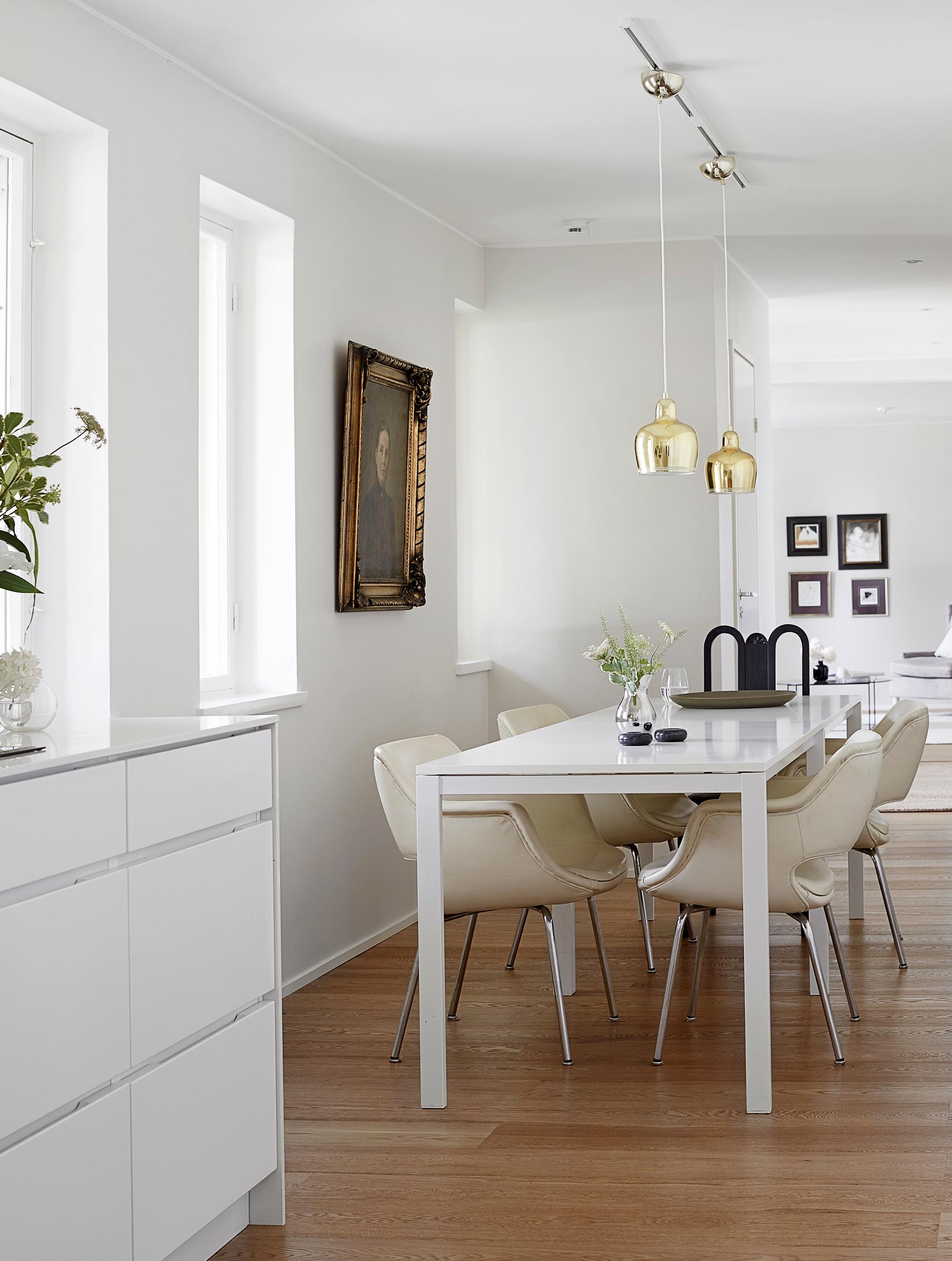
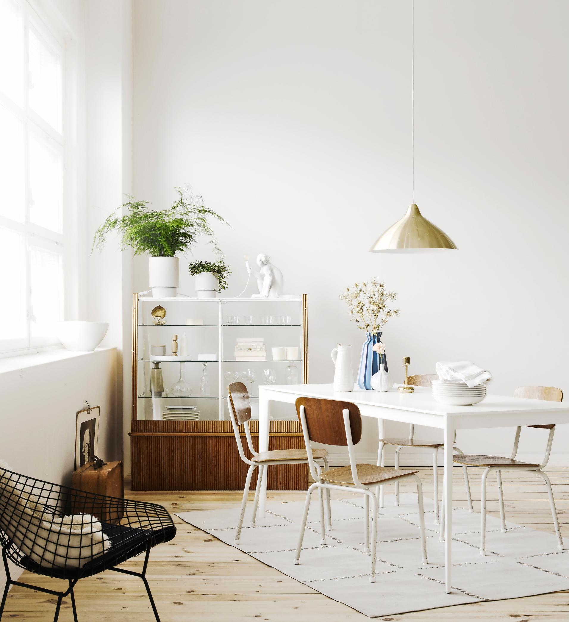
Compare the paint color to other surfaces in the room. Door and window frames, floors, moldings, and light switches might look yellowish next to a pure white or a cool shade. A reliable basic white is Tikkurila’s F497 Paper, while Teknos T1733 pairs well with off-white.
If the doors and moldings are warm-toned, choose a white wall paint that suits them, unless you can repaint everything.


3. Make test swatches
Pick a few appealing white shades from a chart or swatches and buy small samples. Paint areas about A4 in size on the wall in the different shades and observe them at various times of day. Also check them under artificial light, as the light source’s color temperature affects how the paint looks.
Beautiful white shades include Farrow & Ball’s luminous All White TM 2005, Tikkurila White, and F497 Paper. If you prefer not to use latex, consider traditional linseed oil or limewash paint—just be sure they’re suitable for your walls.


4. Don’t mix warm and cool tones
Decide whether to use warm or cool white tones in your home. Don’t mix them, or you’ll risk having the warm white look yellowish and the cool white look dirty.
You can use white paint to accentuate recesses or unique shapes where light and shadow alternate.
5. Avoid a clinical mood
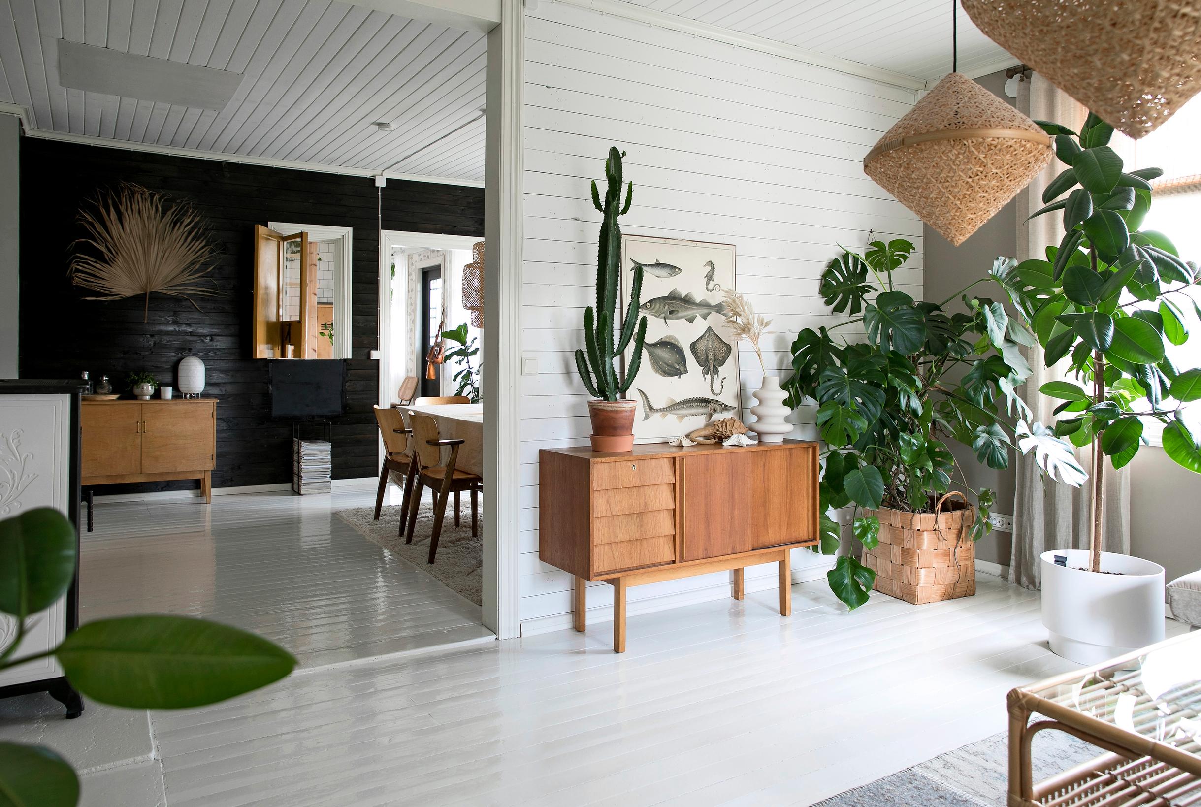
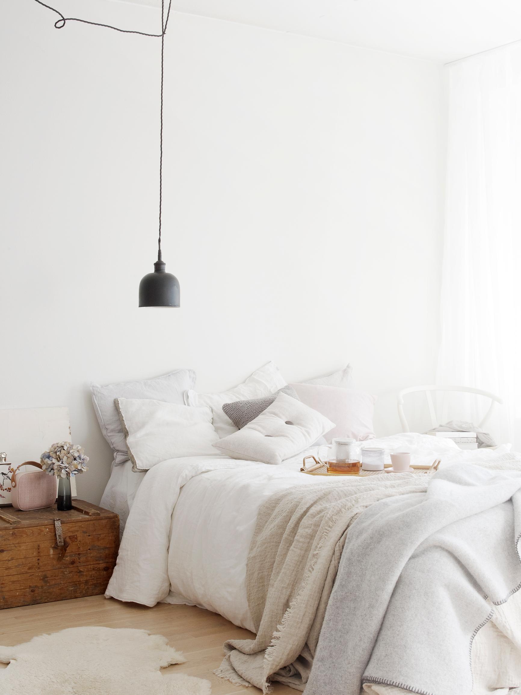
If everything is white from floor to ceiling, it’s harder to get a sense of the space, and the interior can feel clinical. Natural materials such as wood, cork, or stone, along with brass and copper, bring a touch of warmth and texture to an otherwise white interior.
In a white kitchen, choose a shade for the walls that’s slightly darker than the cabinets. Use a gray-tinted white that’s one step darker than the cabinets to prevent a clinical look, for example the grayish H497 Kaoliini.


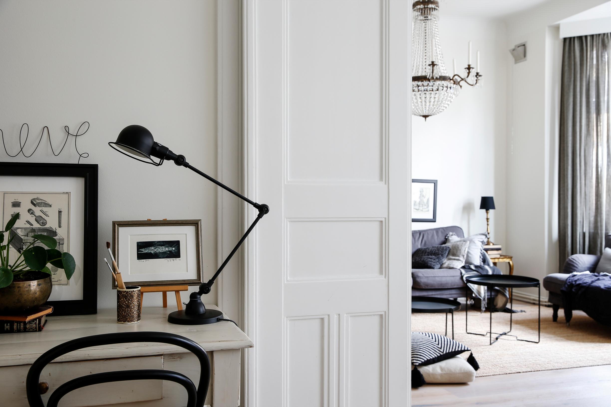
6. Opt for a matte finish
A matte wall paint masks minor surface imperfections and makes the space feel serene and stylish. Fully matte paint is a good pick for living rooms and bedrooms that don’t face heavy wear, as it’s prone to dirt and fingerprints and is harder to wipe clean.

The shinier the paint, the more it highlights imperfections on the wall.
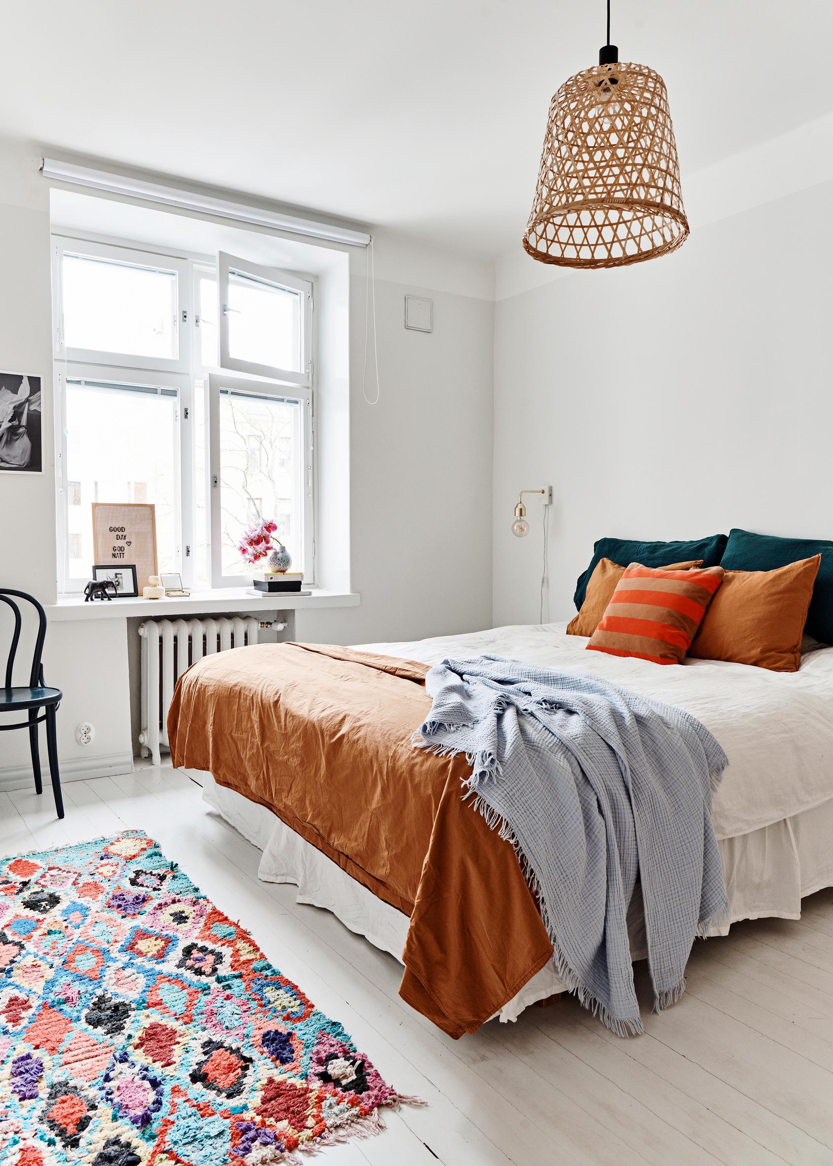
7. Don’t forget the ceiling and floor
Painting the ceiling in a slightly brighter white than the walls makes it appear higher, so the whole room feels more spacious.
When picking a wall color, remember to consider the floor too. If the floor has a warm wood tone, opt for a white with a hint of beige, like Tikkurila’s F468 Meringue. Gray floors can make white walls seem bluish, so a pure white paint is often the best choice.
If you’re thinking of painting a wooden or parquet floor white, avoid bright white. A pale gray floor will look white in sunlight. A durable floor paint option is Betolux in shade X 428.